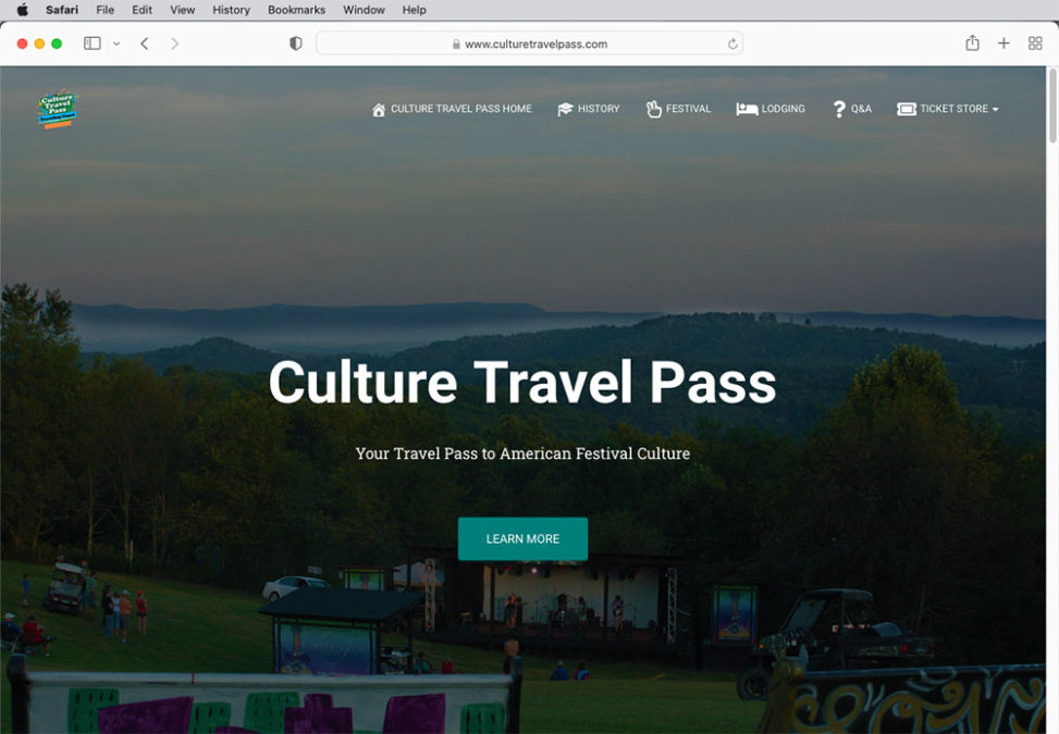
I recently had the opportunity to build a website for a travel and culture venture.
Defining Goals
We cannot achieve our goals if we do not know what our goals are. It is important to clearly communicate with the client beforehand to understand exactly what the client wishes to accomplish. Laying out our goals clearly from the start is the best way to keep the client happy.
In this case, the website was part of a larger marketing plan. The website needs to serve the marketing goals. This includes the functionality of selling tickets. The client had a clear idea of some of the content they wanted. The client entrusted me to present this content as well as possible.
User Interface and User Experience (UI/UX)
In order to present the content to the user as best I can, I need to consider User Experience and User Interface.
User experience (UX) focuses on having a deep understanding of users, what they need, what they value, their abilities, and also their limitations. It also takes into account the business goals and objectives of the group managing the project. UX best practices promote improving the quality of the user’s interaction with and perceptions of your product and any related services.
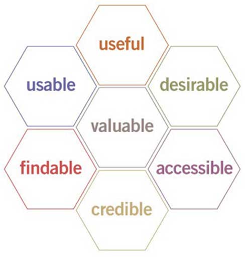
User Interface (UI) defines how a user interacts with technology. A website with a good user interface should be easy and intuitive for a user to navigate. If a user needs to be told how to navigate your website, you should reconsider your UI.
I decided that I wanted to keep the interface simple and clean. I decided to have most of my content on a single page, with buttons to jump up and down the page. This way a user can simply scroll their way down the website, and jump to the sections they find most relevant. I want a floating menu at the top, so that the user never needs to hunt for the buttons. I also need to make sure the user interface works across all platforms. I’ll talk more about that shortly.
Producing Photos

After meeting with the client, I took photos of the destination for the website. I already had a good idea in mind what I wanted the website to look like, but I still shot extra photos. It would be much easier to get all the photos in one day. Going back later on for re-shoots could potentially slow down the whole process, so it’s important to cover all my bases.
Editing Photos in Adobe Photoshop
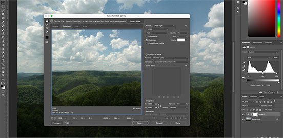
Before I publish any photos to the website, I always edit them in photoshop. I correct colors, reduce the size of the photos, and optimize them to load on the web. Photo optimization is a balancing act between image quality and load times.
Content Management System
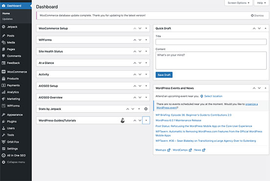
When the web was young, all web pages were built with simple html, and updating content by hand coding often led to broken links. Any modern website today is built on top of a Content Management System (CMS). The biggest advantages of a CMS for me is to make pages and menus easier to update. A CMS keeps this whole website stored in an SQL database. This streamlines the update process and simplifies common tasks. A CMS can also expand its functions by the use of plugins. Some popular CMSs include WordPress, Joomla, and Drupal. I chose WordPress for its excellent plugin support.
Installing WordPress Plugins
When I was defining goals with my client, they made clear to me that selling tickets was one of the goals for this website. Unfortunately, that function is not baked into WordPress by default. In order to meet my client’s goals, I needed to install a plugin. Luckily, WordPress has a robust community of plugins.
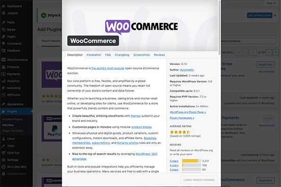
The most popular plugin for selling products and services on WordPress is WooCommerce. It’s so popular, in fact, that WooCommerce has other optional plugins available just to expand WooCommerce. I tend to take a “less is more” approach to plugins. I only install plugins which I need, and I deactivate any plugins I am not currently using. This helps keep the website stable.
Building out Content
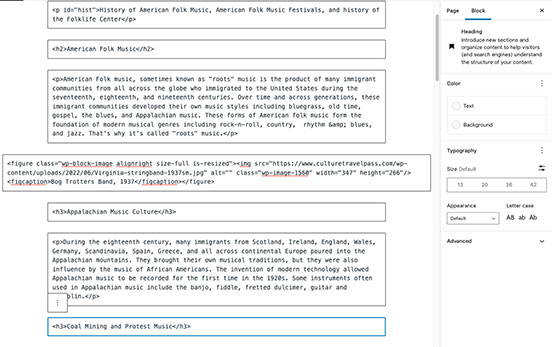
Now that I have the Content Management System all set up, I can start building out content. I will use the photos I shot earlier, some archival photos provided by the client, and start writing some copy to support the client’s goals. This step in the process is the “meat and potatoes” of web design. By which I mean this is the step where I spend most of the time working on the frontend of the website.
Once I have plenty of content built out, I can add a dash of style by applying a WordPress theme.
Applying a Theme
Some web designers like to rush straight to themeing a WordPress installation before they’ve even built out any content. It’s not hard to see why. Applying a theme can certainly be more fun than building content. But how can you know what the theme really looks like without some content to theme? You would only have the theme preview to rely on.
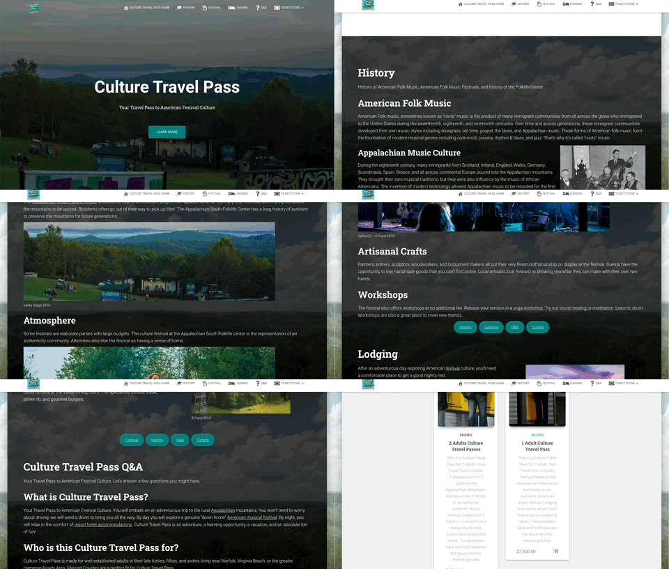
When I was considering a User Interface earlier, I decided that I wanted to keep most of my content on a single page. I kept this consideration in mind when choosing a theme. I chose a theme which was built from the ground up around this sort of user interface.
Testing on Multiple Platforms – Responsive Web Design
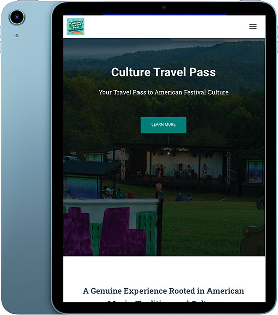
A website needs to load exactly as well on a tablet or smartphone as it does on a desktop or laptop. Different devices have different size screens with different resolution and different pixel density.
The solution to this problem is called Responsive Web Design. With careful planning and well-defined CSS, we can build websites which automatically resize to all different size screens. Images can scale; divs can flex; menus can collapse.
I always make sure to test my websites on different devices to ensure that the user experience (UX) is seamless across Android, iPhone, iPad, and all browsers for Windows and Mac.
User Feedback and Section 508 Compliance
Websites need to be accessible to everyone, including people with impairments. Section 508 defines requirements for accessible technology. The website passed an automated section 508 test, but user feedback indicated that some users found it difficult to read the text links on the home screen, but not on other screens. Let’s take a moment to fix that.
Customizing CSS Stylesheet
The links on the homepage need to be a different color. The color of the links is defined in the CSS stylesheet. We can fix the link color with just a few lines of code.

Conclusion
In order to be successful building this website I needed to define goals clearly, consider the user interface and user experience (UI/UX), shoot some photos, edit those photos in Adobe Photoshop, build a content management system (CMS), install plugins, build out content, apply a theme, test on multiple platforms, check for section 508 compliance, get user feedback, and code a bit of custom CSS. I reviewed the initial goals with the client after I finished. The client was pleased with the website I produced, and continued to use that website as part of their marketing plan.
You can see the website for yourself here: www.culturetravelpass.com.

